
In project management, Gantt charts are mostly used to show how long events or activities would take. As a project management tool, Gantt charts show the workflow timeline and visually represent the dependencies between tasks. Also, they can be used to creatively represent the amount of time spent on various tasks, such as a business’s product delivery schedule or even your television-watching routines!
💡 Ready to test your Excel knowledge?
Thankfully, you don’t have to be an Excel expert to make a Gantt chart. Even while it can be helpful to have some experience with Excel, the following easy steps will help you create a basic Excel Gantt chart.
This tutorial shows you how to make a Gantt chart visualization in Google Sheets, Tableau, or Excel. Because Google Sheets and Excel do not have pre-made Gantt charts, you might want to try Tableau Desktop, which is free.
ALSO READ: What is a Gantt Chart In Excel
How to make a Gantt chart in Excel: A step-by-step guide
Step 1: Collect your Project Data
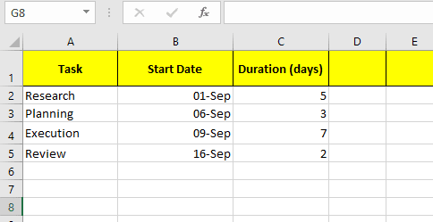
Before you open Excel, write down the basics of your project. You will need:
- Task Name (What Needs to Be Done)
- Start date (when does it begin)
- Duration (how many days will it take)
For example:
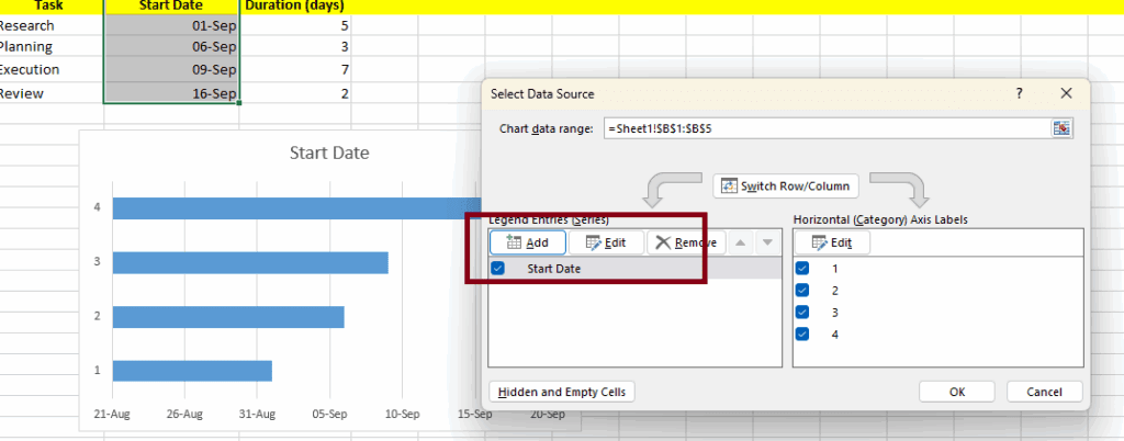
Step 2: Insert a stacked bar chart
- Select your “start date” data (leave the task column for now).
- Go to the Insert tab.
- Select Stacked Bar Chart (not 100% stacked) from the Charts group.

A rough-looking bar chart will appear. Don’t worry, it’s about to make sense.
Step 3: Add task names and duration to the chart
Your chart is most likely confusing right now because of the lack of labels. Here’s how to fix that.
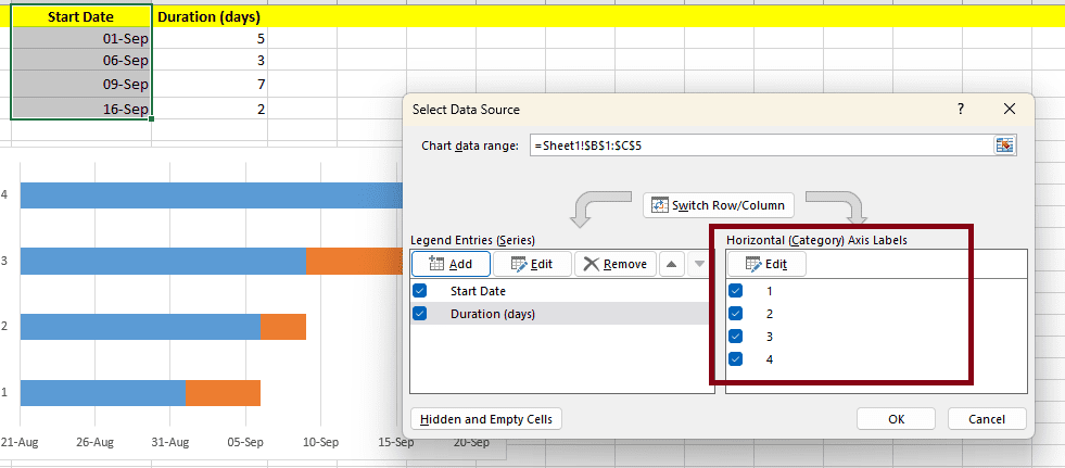
- Right-click on the chart and select Data.
- In legend entries add your duration data.
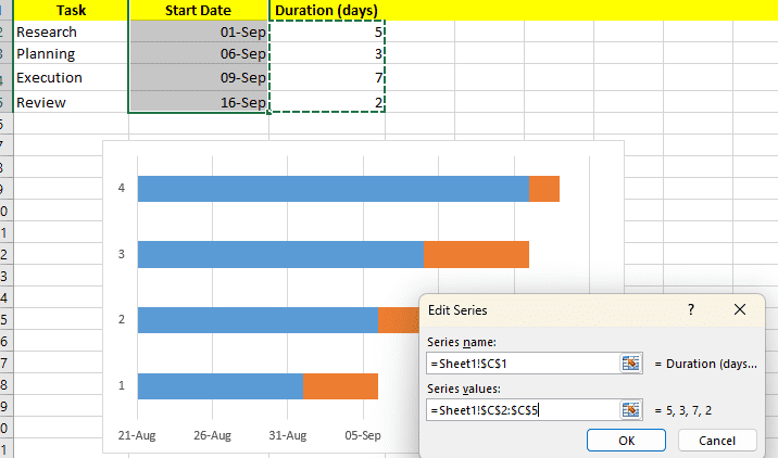
- Now Add your task names to the horizontal axis labels.
- Click on Edit and select Axis Level Range.
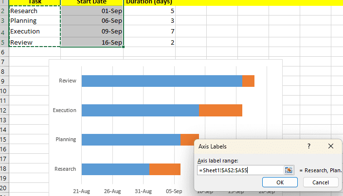
Now your tasks will be properly listed.
Step 4: Turn it into a Gantt chart
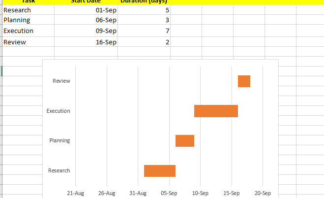
This is where the chart starts look like a Gantt chart. Notice how each task has two bars: one for the start date and one for the duration.
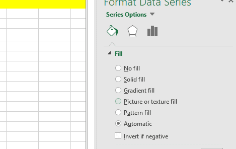
The “Start Date” bar is only a placeholder; it moves the duration bar into the proper position.
To hide it:
- Click on any of the blue “Start Date” bars.
- Right-click and choose Format Data Series.
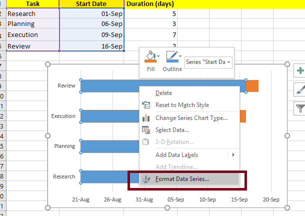
- Change the fill color to no fill.
And with that, you’re left with clean horizontal bars displaying your project timeline.
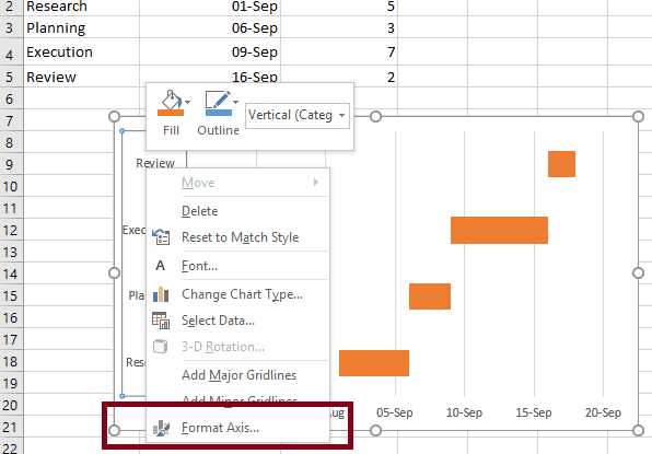
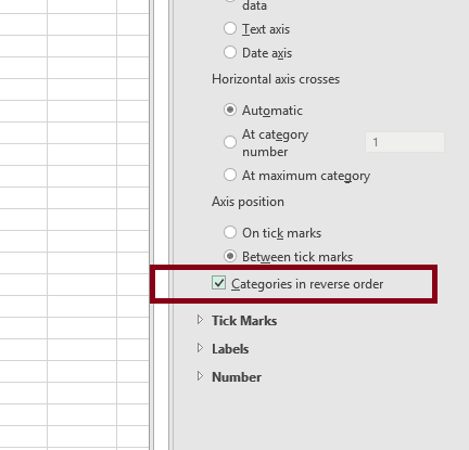
If the tasks appear in reverse order, right-click the vertical axis and choose Format Axis, then check Categories in reverse order.
💡 Pro Tip: Zooming in on weeks or months can improve chart readability for long-term projects.
Why Use Excel to Create Gantt Charts?
Indeed, you can use project management software such as Microsoft Project, Asana, or Smartsheet. But Excel has a few major advantages:
- It is accessible: most people already have Excel installed.
- It is fully customizable: you can change the colors, labels, and dates on the chart.
- It’s simple: Lightweight software is sufficient for small to medium-sized projects.
In short, Excel is best if you want a simple, no-frills Gantt chart with a low learning curve.
The Bottom Line
Creating a Gantt chart in Excel may seem difficult at first if you are a newbie, but once you’ve done it, you’ll realize how useful and simple it is. It only takes a few steps: You have to prepare your data, add a stacked bar chart, clean it up, and customize it.
What was the result? A clear, visual project roadmap that keeps you on track and prevents last-minute surprises.
💡 Ready to test your Excel knowledge?