
The Excel line chart is one of the easiest and most basic charts you can make. But just because something is basic doesn’t mean it’s not useful. People who work with statistics and science like line graphs a lot because they make patterns easy to see and plot.
💡 Ready to test your Excel knowledge?
Let’s look at how to make a line chart in Excel, when it’s most useful, and how it may help you make sense of complicated data sets.
What is Excel line chart (graph)
An Excel line chart (sometimes called a line graph) shows a series of data points that are connected by a straight line. It is often used to show numbers over a given amount of time in a visual way.
Independent data, like time intervals, are usually represented on the x-axis, whereas dependent values, like prices and sales, are plotted on the y-axis. If there are any negative values, they are shown below the x-axis.
The line’s ups and downs on the graph represent patterns in your data collection. An upward slope means values are going up, while a downward slope means values are going down.
ALSO READ: How to Make a Pie Chart in Excel
How To Create a Line Chart in Excel
To create an Excel line chart, do the following:
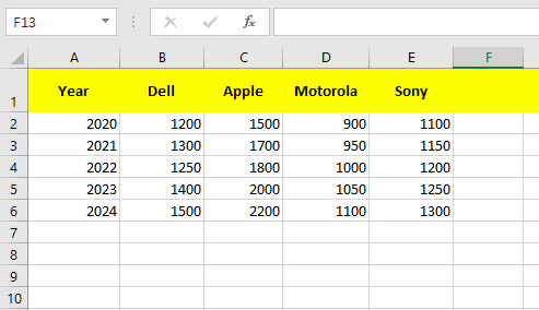
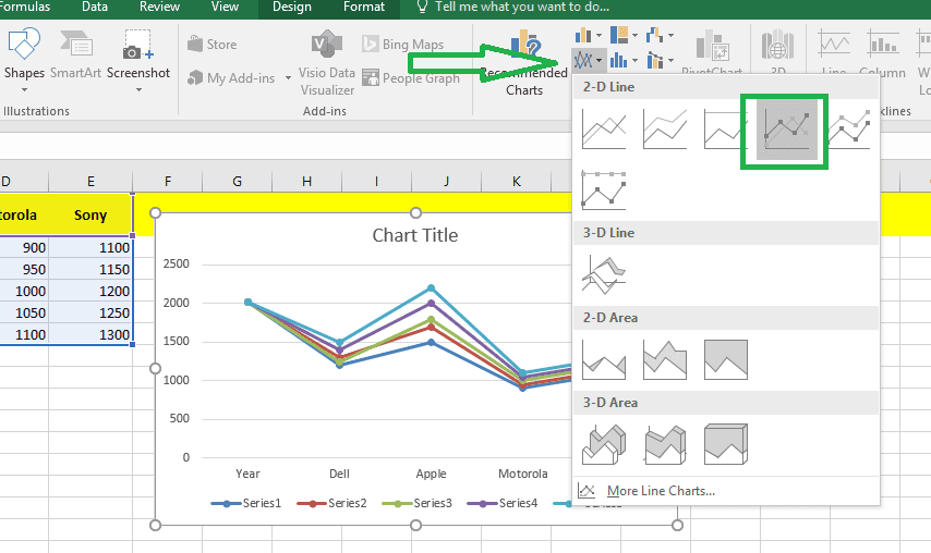
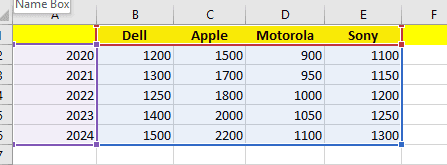
Step 1: Select Your Data
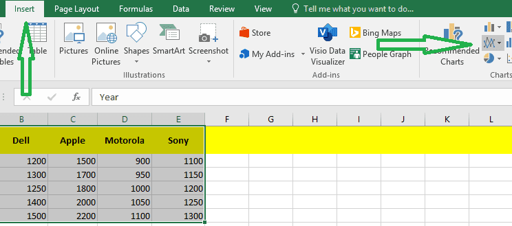
Step 2: Click the Line symbol in the Charts group on the Insert tab.
Step 3: Now Click on the line with Markers.
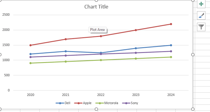
Finally your Excel line Chart will be ready
Important Note: If you simply have numbers as labels, clear cell A1 before making the line chart. Excel doesn’t see the values in column A as a data series when you do this, so it puts them on the horizontal (category) axis by default. You can type the word “Year” into cell A1 after making the chart if you want to.
RELATED: How to Make a Bar Chart in Excel
How to customize and improve an Excel line chart
The default line chart that Excel makes looks OK, but it can always be better. It makes sense to start with the usual changes to give your graph a unique and professional style, such as:
- Adding, altering, or formatting the title of the chart.
- Moving or concealing the legend for the chart.
- Changing the scale of the axis or the format of the numbers on the axis.
- Showing or hiding the gridlines on the chart.
- Changing the colors and design of the chart.
💡 Ready to test your Excel knowledge?