

A scatter plot in Excel is a useful visualization tool for identifying trends, connections, and patterns between two data sets. By charting data points on an Excel XY scatter plot, you can gain insights into relationships and outliers, making it an important tool for data analysis.
💡 Ready to test your Excel knowledge?
In this article, you will learn how to create a scatter plot in Excel in simple steps.
What Is a Scatter Plot in Excel?
A scatter plot in Excel, or an XY graph, is a form of graph used to show and analyze the relationship between two different variables.
The horizontal (x-axis) and vertical (y-axis) display numeric data in a scatter plot. Usually, the independent variable appears on the x-axis, while the dependent variable is shown on the y-axis. The chart displays values at the intersection of the x and y axes, represented as individual data points.
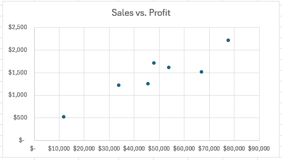
Following is an example of a scatter plot that shows the relationship between sales and profitability in a specific organization:
RELATED: How to Make a Bar Chart in Excel
How to Make a Scatter Plot in Excel
Learning how to make a scatter plot in Excel is simple and helps you visually explore the relationships between data points. Follow these steps to build a scatter graph in Excel and edit your scatter chart:
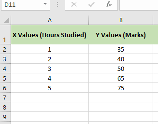
Step 1: Preparing our Excel Data
- Arrange all of your data into two columns:
- There is one column for the X-axis data (the independent variable).
- The second column includes the Y-axis data (dependent variable).
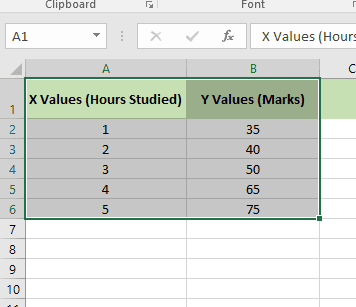
Step 2: Select all Your Data
- Select both columns of data, with the headers.
- Check that the data is clean, with no empty cells or text in numerical ranges.
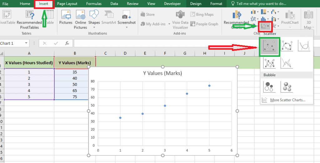
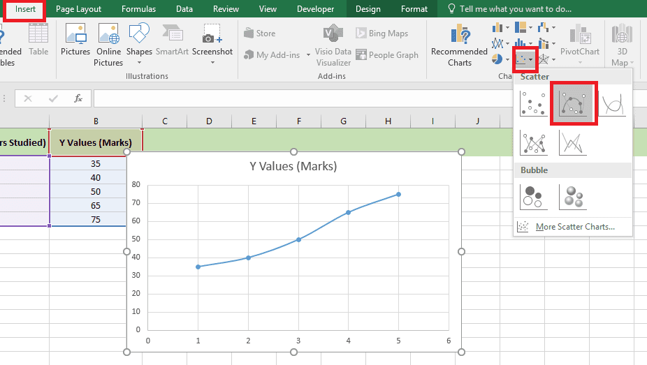
Step 3: Choose the Chart
- Click on the Insert tab in the Excel ribbon.
- In the Charts group, choose the Insert Scatter (X, Y) Chart option.
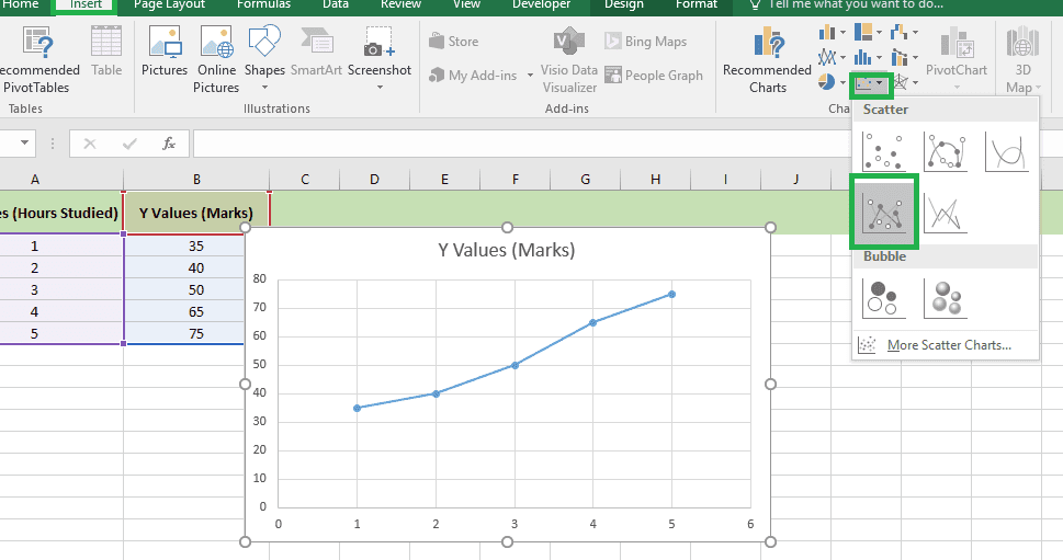
- Choose one of these scatter plot options:
Type 1: Scatter Chart (common, with only points).
Shows individual data points (dots) showing connections or relationships between the two data points.
Type 2: Scatter Plot with Smooth Lines
Interconnects data points with smooth, curved lines to show the overall trend. It is ideal for displaying non-linear relationships or natural transitions in data.
Type 3: Scatter Plot with Straight Lines
Connects data points with straight lines to display trends or relationships between data points. It is used when you need to clearly display data progress or pathways.
RELATED: How to Use PivotTables in Excel: A Beginner-Friendly Guide
Types of Scatter Plots in Excel
- Scatter Plot with Smooth Lines and Markers, good for showing a small number of data points.
- Scatter with Smooth Lines, perfect for showing many data points.
- Scatter with straight lines and markers, ideal for showing a smaller number of data points.
- Scatter with Straight Lines, useful for showing several data points.
Customizing an XY Scatter Plot in Excel
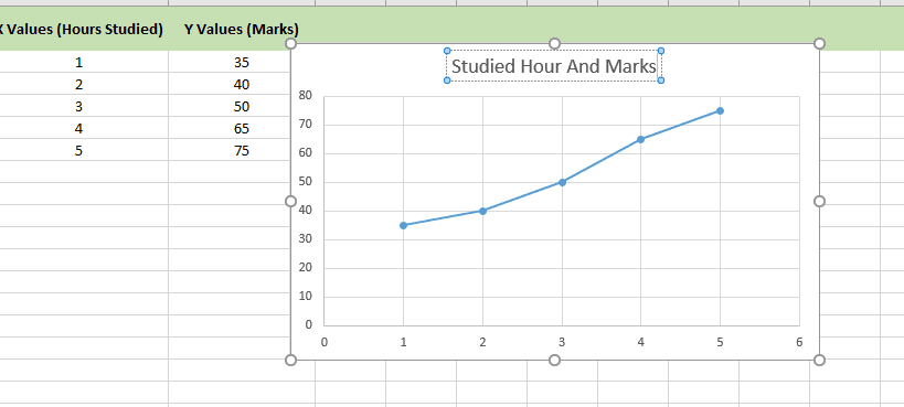
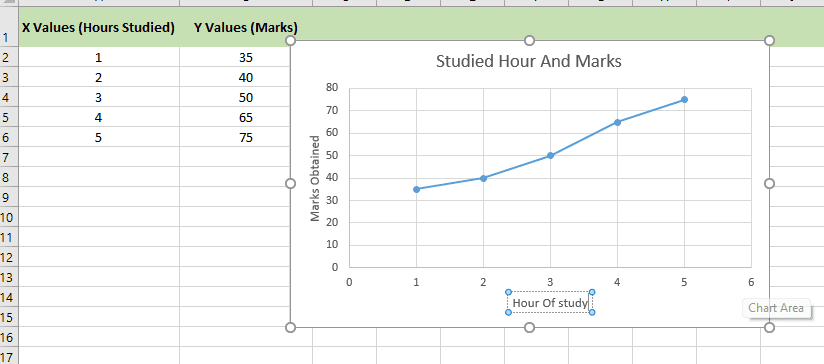
1: How To Add Chart Title in Scatter Plot
- Click the default chart title at the top of the graph.
- Use a suitable title, such as “Studied Hour And Marks“.
2: How To Add Axis Titles in Scatter Plot
- Click the chart to activate the Chart Elements button (the “+” icon).
- Check the Axis Titles box.
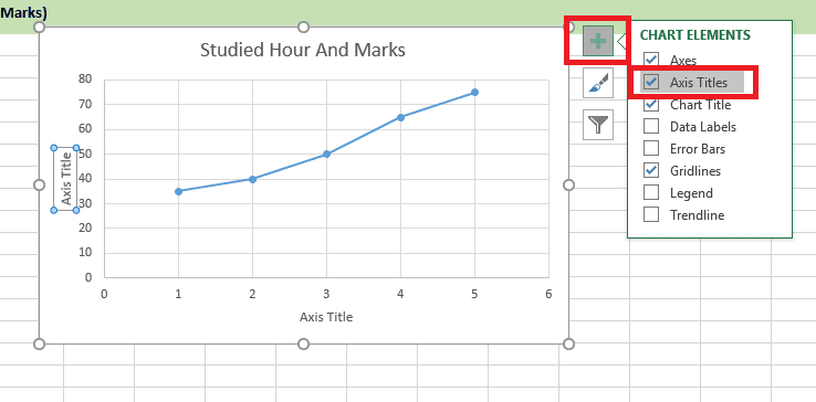
Simply rename the titles:
- Horizontal Axis: “Hour Of Study.”
- Vertical Axis: “Marks Obtained.”
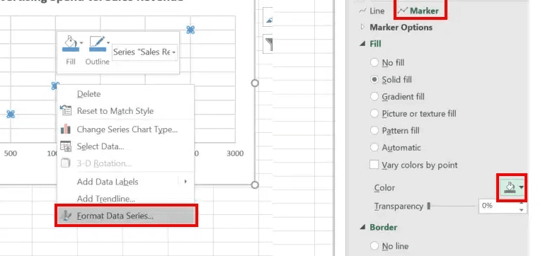
3: How to Format the Data Points In Scatter Plot
First, right-click on any data point (dot) and choose “Format Data Series.”
Customize the data points:
- Change the color of the dots.
- Adjust the marker shape (e.g., circles, squares, or triangles).
- Increase or decrease the marker size for clarity.
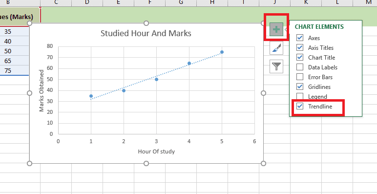
Add and Customize a Trendline
A trendline shows the overall direction of the chart’s data points. It helps to display the connection between two variables on a chart, making it easy to study and understand the data.
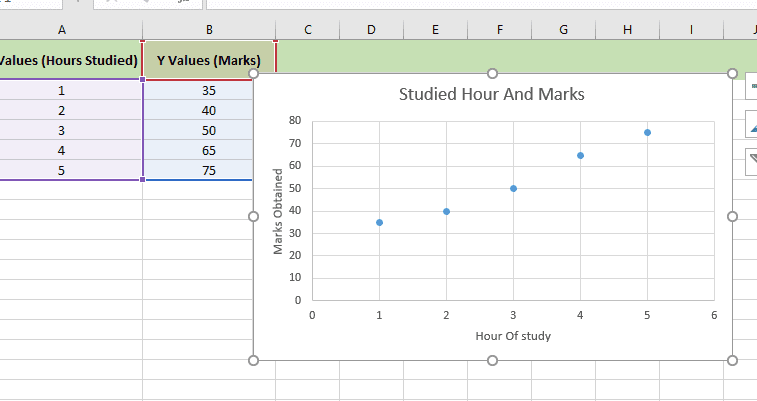
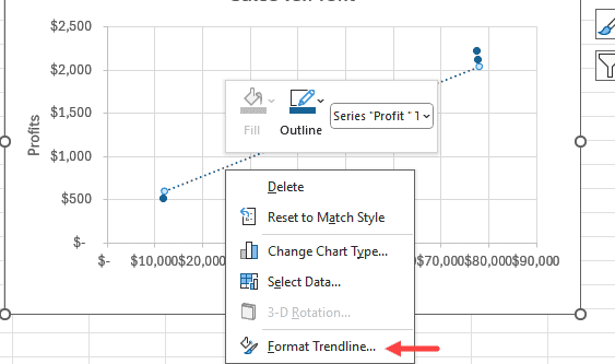
Assume you have created the scatter graph below and you want to add a trendline:
To add a trendline to the scatter plot, choose the chart, click the Chart Elements button at the top right of the chart, and select the Trendline option:
If you want to remove the trendline,. Simply reverse the process.
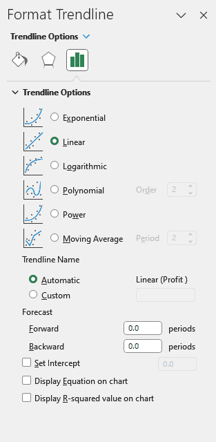
To format the trendline, you can right-click on the created graph and then choose “Format Trendline.”
The previous step shows the Format Trendline pane to the right of the Excel window.
Final Thought
Learning how to create a scatter plot in Excel is a very important skill for anybody working with data. Scatter plots help you see connections, identify trends, and make smart decisions quickly. With just a few clicks, Excel turns raw numbers into valuable insights.
💡 Ready to test your Excel knowledge?