
A picture is worth a thousand words—and a chart is worth a thousand rows of data. If you’ve ever stared at a spreadsheet full of numbers trying to spot a trend, you already know why Excel charts are so valuable.
In this tutorial, you’ll learn exactly how to create a chart in Excel from scratch, which chart type to choose for your data, and how to customize it to look polished and professional. Whether you’re a student, analyst, or small business owner, this guide will have you building charts in minutes.
📊 What you’ll learn: How to insert a column chart in Excel, understand all major chart types, and customize your chart using Chart Tools—using a real sales dataset as our example.
What Is a Chart in Excel?
A chart (also called a graph) is a visual representation of data from your spreadsheet. Instead of reading through rows and columns of numbers, a chart lets you see patterns, comparisons, and trends instantly.
Charts are especially useful when you need to:
- Spot trends over time—such as monthly revenue growth or seasonal dips
- Compare values across categories—like sales performance by product or region
- Show proportions or percentages—ideal for market share or budget breakdowns
- Present data clearly in reports—charts make dashboards and presentations far more impactful
According to Microsoft’s official Excel support documentation, charts help communicate data insights far more effectively than raw numbers alone—making them one of Excel’s most powerful features.
Sample Data for This Tutorial
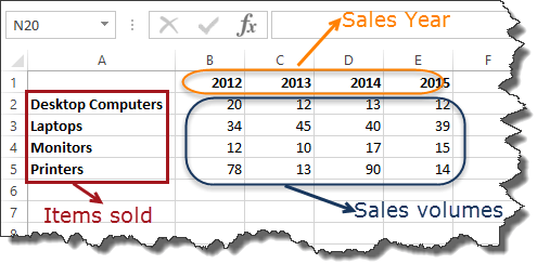
We’ll use the following sales data throughout this guide. It tracks units sold across four product categories from 2012 to 2015.

ALSO READ: How to Calculate CAGR in Excel (5 Easy Ways)
Sample dataset: Items sold (rows) vs. Sales Year 2012–2015 (columns) — the data we’ll chart
| Item | 2012 | 2013 | 2014 | 2015 |
| Desktop Computers | 20 | 12 | 13 | 12 |
| Laptops | 34 | 45 | 40 | 39 |
| Monitors | 12 | 10 | 17 | 15 |
| Printers | 78 | 13 | 90 | 14 |
Note: Screenshots in this tutorial are from Excel 2013. Menus may look slightly different in newer versions, but the steps are the same.
Types of Charts in Excel—Which One Should You Use?
Excel offers over 15 chart types. The right one depends on the story your data needs to tell. Here’s a quick reference:
| Chart Type | When to Use It | Real-World Example |
| 📊 Pie Chart | Show parts of a whole as percentages (best with 2–6 categories). | Market share breakdown by brand |
| 📊 Bar Chart | Compare values across categories—values run horizontally. | Sales performance by region |
| 📊 Column Chart | Compare values across categories—values run vertically. | Quarterly units sold by product type |
| 📈 Line Chart | Visualize trends and changes over time (months, quarters, years). | Revenue growth over 5 years |
| 📊 Combo Chart | Combine two chart types—e.g., bars and a line—to show different data. | Sales volume vs. target achievement |
| 📈 Area Chart | Like a line chart, but emphasizes volume and magnitude of change. | Website traffic trends over time |
| ⚫ Scatter Chart | Show relationships or correlations between two numeric variables. | Ad spend vs. revenue |
💡 Pro Tip: Use Excel’s Recommended Charts feature (Insert → Recommended Charts) to let Excel automatically suggest the best chart type for your data. It’s a great starting point when you’re unsure.
For an excellent deep dive into picking the right chart for any dataset, we recommend Storytelling with Data by Cole Nussbaumer Knaflic—the go-to book for data visualization best practices.
Why Charts Matter—The Benefits of Visualizing Data
- Faster understanding: The brain processes visuals 60,000x faster than text—charts make insights immediate.
- Easier comparisons: Spot the biggest and smallest values in a data set at a glance.
- Trend detection: Line and column charts reveal upward or downward trends that are invisible in raw numbers.
- Better communication: Charts make reports and presentations more engaging and accessible.
- Outlier identification: Unexpected spikes or drops stand out clearly in a well-designed chart.
How to Create a Chart in Excel—Step by Step
Let’s build a clustered column chart using the sales data above. A column chart is perfect here because we’re comparing quantities (units sold) across multiple product categories over several years.
Step 1: Select Your Data
Click on any cell within your data, then highlight all of it—including the row and column headers. In our example, that’s the range A1:E5.
Step 1: Select the full data range including headers (A1:E5 in this example)
Step 2: Insert a Column Chart
With your data selected, go to the Insert tab in the Excel ribbon. Look for the Charts group and click the Column chart dropdown button.
- Highlight all your data (A1:E5 in our example, including headers)
- Click the INSERT tab in the Excel ribbon
- Click the Column chart dropdown button in the Charts section
- Select Clustered Column (first option under 2-D Column)
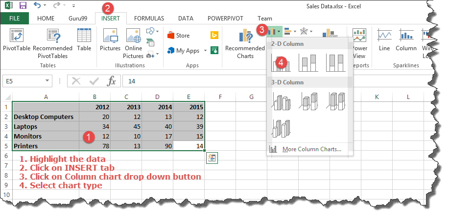
Step 2: Insert tab → Column chart dropdown → Choose 2-D Clustered Column (option 4 highlighted)
Step 3: View Your Chart
Excel immediately generates a chart from your selected data. It appears on the same worksheet. You can click and drag the chart to reposition it anywhere on the sheet.
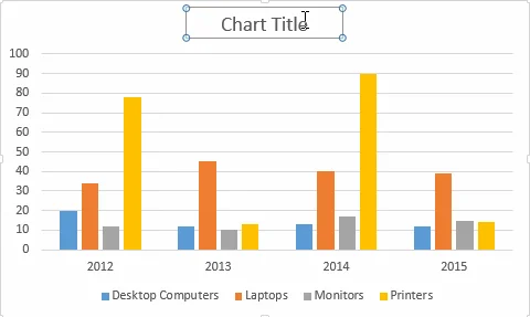
Step 3: The resulting column chart — each color represents a product, years are on the X-axis, units sold on the Y-axis
✅ What you’ll see: Each product gets its own color bar. Years run along the bottom (X-axis). Units sold run up the side (Y-axis). A legend identifies each product color.
Step 4: Customize With Chart Tools
Click on your chart to activate the Chart Tools section in the ribbon. This reveals two powerful tabs — Design and Format — packed with customization options.
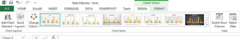
Chart Tools ribbon — Design tab showing Chart Layouts, Chart Styles, Switch Row/Column, and Select Data
Key things you can customize:
- Chart Title: Click the ‘Chart Title’ placeholder on the chart and type a clear, descriptive name.
- Chart Style: Pick a preset style from the Chart Styles gallery to instantly update colors and formatting.
- Switch Row/Column: Swap which data series appears on the X-axis vs. in the legend.
- Add Chart Elements: Add axis titles, data labels, gridlines, or a trendline via the Design tab.
- Change Colors: Use the Change Colors button to apply a different color palette in one click.
For advanced chart formatting techniques, Chandoo.org’s Excel Charts Guide is one of the most comprehensive free resources available — highly recommended for anyone who works with Excel data regularly.
5 Expert Tips for Better Excel Charts
- Keep it simple. Don’t overload one chart with too many data series. If you have 10+ categories, split them across multiple charts.
- Always add a descriptive title. A chart without a title forces viewers to guess. ‘Product Sales 2012–2015’ beats ‘Chart 1’ every time.
- Label your axes. Add axis titles so viewers instantly know what the X and Y axes represent without having to read surrounding text.
- Use consistent colors. If desktop computers are blue in one chart, keep them blue in every chart in your report.
- Choose the right chart type. A pie chart with 12 slices is nearly unreadable. Match the chart type to the data story you’re trying to tell.
Want to take your Excel charting skills to the next level? The Data Visualization with Excel on Coursera is a great structured course for building dashboard-quality visuals.
Frequently Asked Questions
Does Excel have a chart wizard?
Older versions of Excel (2003 and earlier) had a Chart Wizard. In modern Excel (2007 and later), this has been replaced by the Insert → Charts section in the ribbon, which is more flexible and intuitive.
How do I create a chart in Excel from a table?
Click anywhere inside your Excel Table, go to Insert → Charts, and choose your chart type. Excel automatically uses the table data, and the chart will update dynamically when you add new rows.
Can I create a chart in Excel for the Web?
Yes. Excel Online supports basic chart creation. Select your data, go to Insert → Chart, and choose a type. Full customization options are available in the desktop version.
How do I change a chart type after creating it?
Right-click on the chart and select ‘Change Chart Type’. A dialog will open where you can switch to any available chart type or subtype without losing your data.
What is the best chart type for showing trends over time?
A line chart is generally best for showing trends over time — especially for continuous data like monthly sales, stock prices, or website traffic. Use a column chart if you also want to emphasize the magnitude of values at each point in time.
Final Thoughts
Creating charts in Excel is one of the fastest ways to transform raw data into insights that anyone can understand at a glance. Start with the simple column chart from this tutorial, then explore pie charts, line charts, and combo charts as your skills grow.
The key is practice. The more charts you build, the more naturally you’ll develop an instinct for which chart type tells your data story most effectively.
Have a question or an Excel chart tip to share? Drop a comment below — we’d love to hear from you!