
🚀 Don't Miss This Important Resource!
Explore Our Advance Xcel Tools Free !There are a lot of tools that can be used to make bar charts. But for a lot of people, Excel is the best way to make bar charts. This tutorial will show you how to create a bar chart in Excel for Office 365, step by step. Let us look at what a bar chart is first before we start making one.
💡 Ready to test your Excel knowledge?
What is a bar chart?
For example, the number of years a product has been sold, the number of medals each country won at the Olympics, the growth rate of GDP per quarter, and so on. In all of these cases, it’s about seeing how a number looks for different groups (like years, countries, or quarters), which is usually done with bars. The number values that go with each category are related to the length of the bars. The bars can be set up either straight up or down. You might also hear this kind of chart called a bar chart, bar plot, or column chart.
What is a bar chart used for?
Bar charts, like other ways to show data, can be used for many things if they are made correctly. You can use the chart to educate, compare, and persuade because it is simple to understand. Data visualisation is a field that isn’t very old, and one of the first things that was used was a bar chart. Scotland’s William Playfair, an engineer and economist, was the first person to use a bar chart at the end of the 18th century. As part of a chart showing goods brought into and out of Scotland by Playfair, the bar chart was made public. The pie chart was also made by Playfair.
How To Edit Chart Background
To change the background, right-click on the chart area and choose Format Plot Area. You can change the chart’s borders, fill, and size in this menu. You can also choose from different design formats, such as adding a glow or 3D effects.
ALSO READ: How to Create a qbj File From Excel
How to Create a Bar Chart in Excel
Making a bar chart in Microsoft Excel is easy and can help you show and compare data in a clear way. Bar charts are great for showing differences between groups, like sales by product or expenses by department.
Use these step-by-step instructions to make a bar chart in Excel that looks professional.
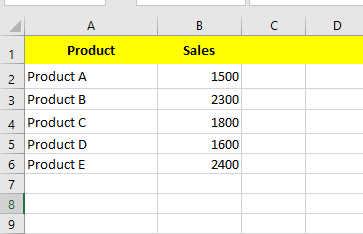
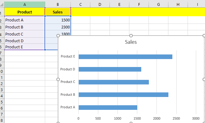
Step 1: Prepare Your Date
The first thing you need to do is put your data in a structured way.
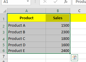
Step 2: Select the data range.
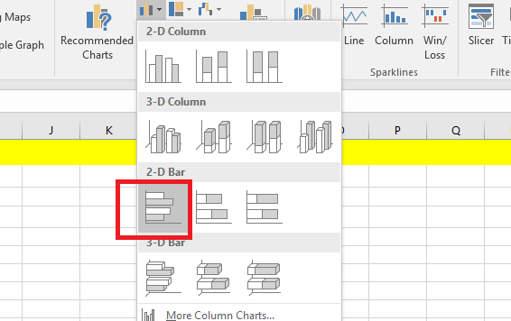
Step 3: Click the Column symbol in the Charts group on the Insert tab.
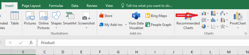
Step 4: Click Clustered Bar.
Finally, your chart will be created.
💡 Ready to test your Excel knowledge?