


Pie charts are one of the easiest and most useful ways to show proportions in a dataset. A well-designed pie chart can help your audience quickly understand important information, whether you’re showing market share, survey results, or budget allocations.
💡 Ready to test your Excel knowledge?
This guide will show you how to make a pie chart in Excel, change it to make it clearer, and look at more advanced types like doughnut charts and exploded pie charts to highlight important data points.
What Is a Pie Chart in Excel?
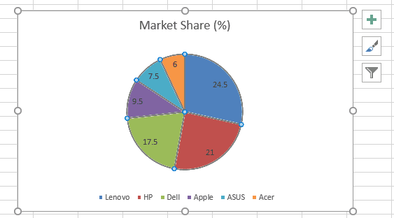
A pie chart is a round graph that shows data as slices of a whole. Each slice shows how much a category adds to the whole. You only need one set of data and a set of labels to make a pie chart in Excel. Pie charts are used every day for things like:
- Market share analysis: Looking at how competitors in the same industry measure against each other
- Results of the survey: Showing how responses were spread out
- Budgeting: Seeing how expenses are broken down in financial reports
Pie charts are great for showing how things are related, but they work best with a small number of categories (five or fewer is best) to keep things from getting too busy and confusing. In other words, pie charts don’t work well with data that has a lot of different values.
ALSO READ: How to Make a Bar Chart in Excel
How to Create a Pie Chart in Excel
Step 1: Adding Data in Excel
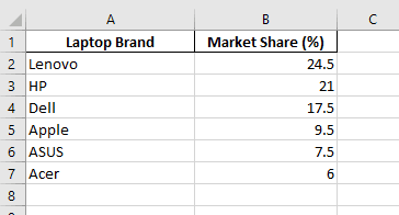
Open Excel and put in the information you wish to see as a pie chart.

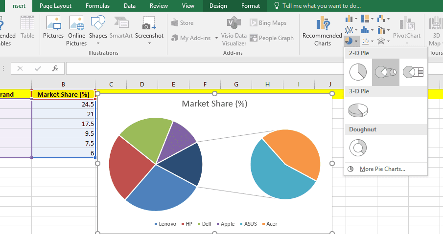
Step 2: Select your Data
Highlight the information you put in the first step. After that, click the “Insert” option in the toolbar and choose “Insert Pie or Doughnut Chart.” Excel has a lot of ways to make a pie chart, like a 2D pie chart, a 3D chart, and more.

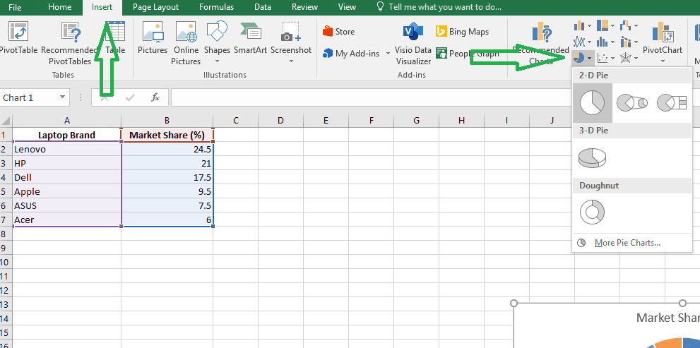
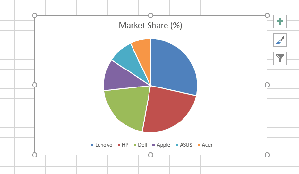
After that, pick the pie chart you want, and it will show up on your spreadsheet.

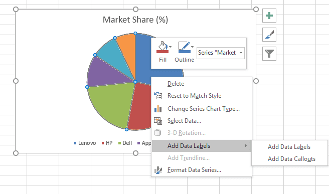
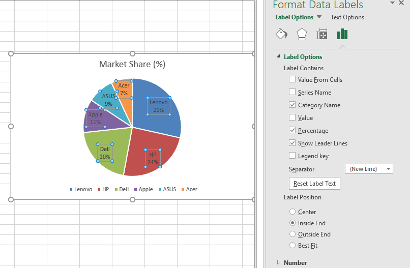
Step 3: Adding Data Labels
Adding data labels is an important part of learning how to construct a pie chart in Excel. It’s easier to understand and read pie charts and other visualizations when you add data labels to them. When you make pie charts in Excel, a legend is automatically added. The names of the categories will also show up on the pie chart if you typed them in and chose them while building the chart. To show numbers, right-click on the pie chart and choose “Add Data Labels.”


To change the look of data labels, right-click on the pie chart and choose “Format Data Labels.” In the Format Data Labels pane, you may choose the options you want, like the category name, percentage value, and so on. You can also change the format of data series. You may also modify the color and size of the typeface.

RELATED: How to Create a Gantt Chart in Excel
How To Create Different Pie Chart Types In Excel?
You can choose any one of the following subtypes when you are creating a pie chart in Excel:
Pie Of Pie or Bar Of Pie
It’s really simple and quick to make a Bar Of Pie or Pie Of Pie chart in Excel. Go to the Insert tab and choose either Pie Of Pie or Bar Of Pie after you’ve added and highlighted the data.

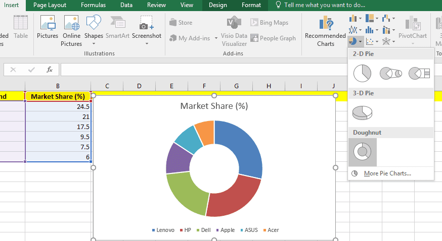
Doughnut Chart
Doughnut charts are similar to pie charts, but they have a blank space in the middle where you can put important information about the data. You can make a doughnut chart in Excel the same way you make a pie chart: just pick the “Doughnut Chart” option.

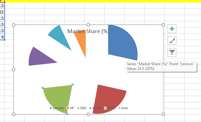
Exploded pie charts
An exploding pie chart splits one or more slices from the remainder to draw attention to certain data points. This is helpful if you want to draw attention to an important group, such as the biggest or smallest contributor.
To explode a pie chart, click on a slice and drag it away from the rest of the chart.

💡 Ready to test your Excel knowledge?