



A well-designed interactive sales dashboard makes it easier to compare products, track revenue, and respond quickly to business inquiries.
You can quickly create an interactive sales dashboard by utilizing Excel’s modern features, such as Pivot Tables, charts, and formulas, to analyze business performance effectively.
In this step-by-step tutorial, we will show you how to create a sales dashboard in Excel that helps you visualize sales data, monitor key metrics, and make better business decisions.
Here is the Step-By-Step guide to Create a Sales Dashboard in Excel
Step 1: Prepare Your Data
Save your information in Excel. You can import data into Excel using Power Query if you need to export data from an outside source. Make your raw dataset clean and organized. Next, develop an organized reference that aids in the creation of a useful dashboard.
Let’s look at an example sales dataset with the following columns: Date, Region, Product, Category, Units Sold, Unit Price, Total Sales, etc.
Put in a Table Format:
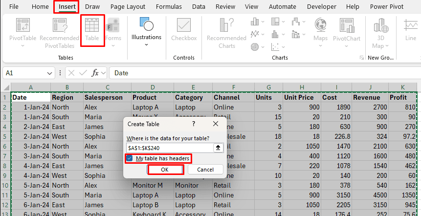
- Choose your data, including the headers.
- Select Table from the Insert tab or hit Ctrl + T.
- “My table has headers” is checked.
- Press OK.

Select “SalesData” as the table name under the Table Design tab.

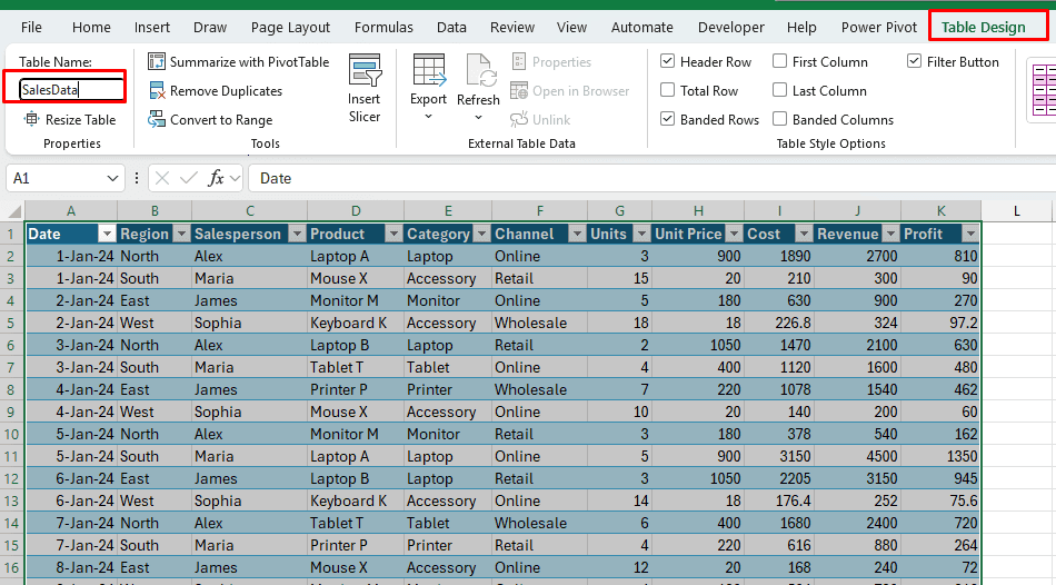
When you add data, Excel tables automatically enlarge and simplify the writing of formulas. Dashboard components, formulas, and analysis become dynamic as a result.
ALSO READ: How to Create an Invoice in Excel
Step 2: Create a PivotTable for KPI metrics
An interactive dashboard’s KPI metrics are among its most important features. It is always the stakeholder’s preference to see it first. A few important top-level metrics, like total revenue, total units sold, and the number of orders, should be on your dashboard. To display these metrics in an attractive manner on the dashboard, let’s make a PivotTable.
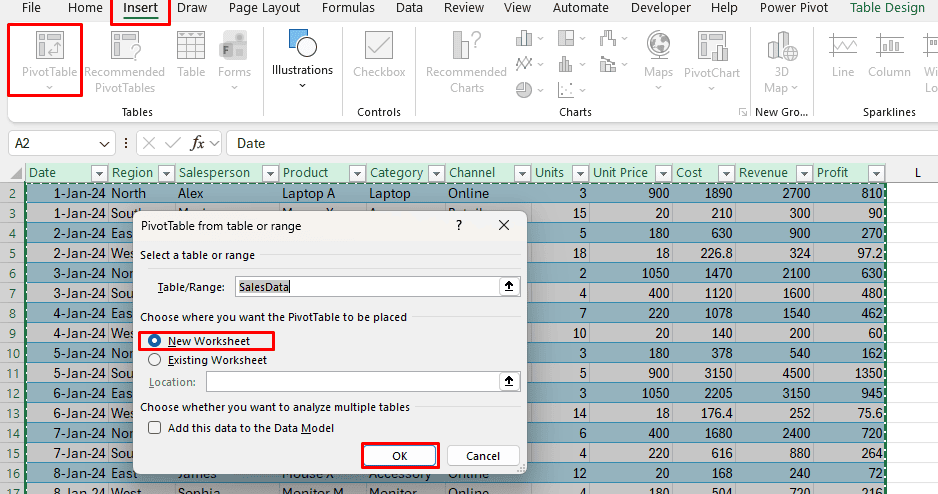
- Select any cell within the SalesData table.
- Click the Insert tab and select PivotTable.
- Rename the new sheet to Pivot_KPI after choosing New Worksheet as the location and clicking OK.

Using the PivotTable Fields pane:
- Move Revenue to the Values section.
- Move Revenue to the Values section. Right-click, choose Summarize Values By, then select Average.
- Move Profit to the Values section.
- Move Units to the Values section.
- Move Date to the Values section. This will indicate the number of orders.

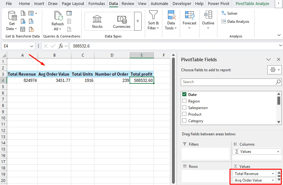
All of the KPIs will be available in a single, compact PivotTable with no rows or columns. Your KPI cards will be driven by this PivotTable, which will then react to slicers.
Step 3: Create PivotTables and Insert PivotCharts
When dashboards have charts that respond to choices, they become more effective. Use PivotCharts to insert charts so that slicers are automatically connected. To feed the charts, make a few more PivotTables.
Income by Date (Line Chart)
To add another PivotTable, click inside the SalesData table once more.
Change the sheet’s name to Pivot_Date.
From the PivotTable Fields pane:
- Drag Revenue to Values.
- Drag Date to Rows.

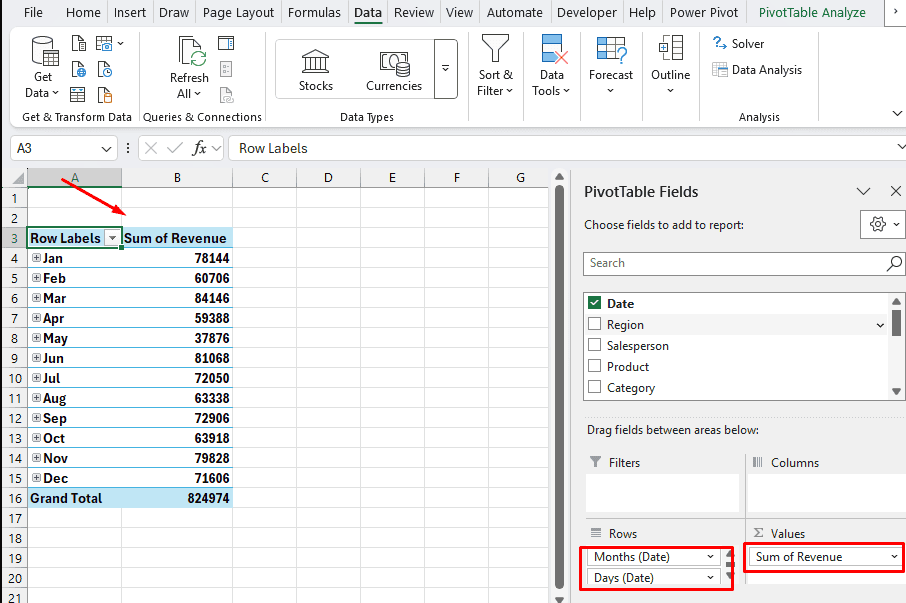
Dates are automatically grouped in Excel. If not, you can group by Days or Months by right-clicking on any date in the PivotTable and selecting Group. Daily grouping works well for such a small sample.
- Click within the PivotTable.
- Choose PivotChart after selecting the PivotTable Analyze tab.
- Select Line Chart after choosing Line or Area Chart.
- Click OK.

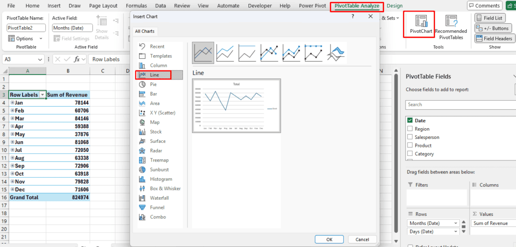
- A line chart displaying revenue over time will be inserted into Excel.
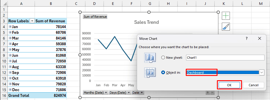
- Choose the chart, then select the Chart Design tab, Move Chart, Object in, and Dashboard.
- Click “OK.”

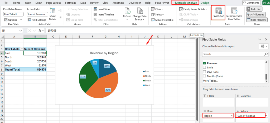
Income by Region (Pie Chart)
Change the sheet’s name to Pivot_Region and add another PivotTable.
From the PivotTable Fields window:
- Drag the Area to the Rows.
- Drag Income to Values.
Make a pie chart that shows revenue by area.
- Choose any PivotTable cell.
- Choose PivotChart after selecting the PivotTable Analyze tab.
- Click OK after selecting Pie Chart.
- Additionally, move this chart to the Dashboard sheet.

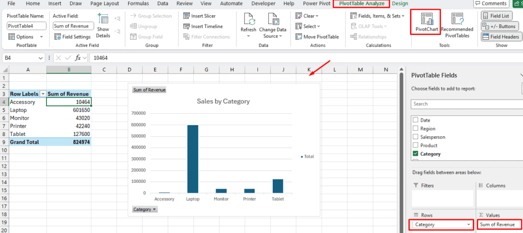
ncome by Category (Column Chart)
Rename the sheet Pivot_Category after inserting a PivotTable.
From the PivotTable Fields window:
- Drag Revenue in Values.
- Drag Category in Rows.
To display revenue by category, insert a Clustered Column chart.
- Choose the PivotTable.
- Choose PivotChart after selecting the PivotTable Analyze tab.
- Click OK after selecting the Clustered Column Chart.
- This chart should be moved to the dashboard sheet.

Top 10 Product (Filter)
Rename the sheet to Top_Products and add a PivotTable.
Using the PivotTable Fields window:
- Drag Items to Rows.
- Drag Revenue to Values.
- Right-click, choose Sort descending, then Show Top 10.

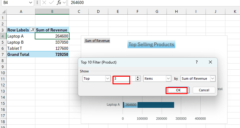
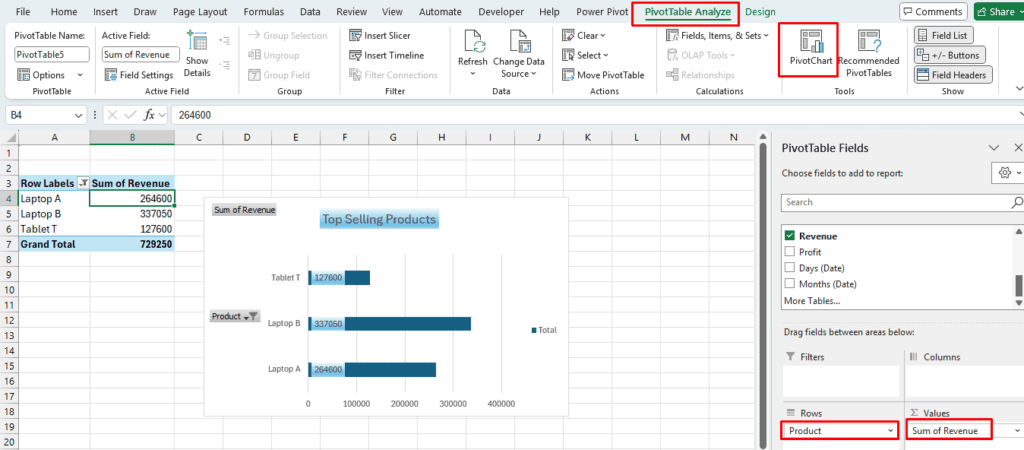
Add a bar chart showing revenue by category.
- Choose the PivotTable.
- Select the Bar Chart.
- This chart should be moved to the dashboard sheet.

RELATED: XLOOKUP vs VLOOKUP: Differences Between VLOOKUP and XLOOKUP in Excel
Step 4: Create an Interactive Filtering Timeline and Slicers
The dashboard’s slicers give it its interactive features. With just one click, you can filter all of the PivotTables, and consequently, KPIs and charts. After creating slicers on one PivotTable, you will connect them to every other PivotTable.
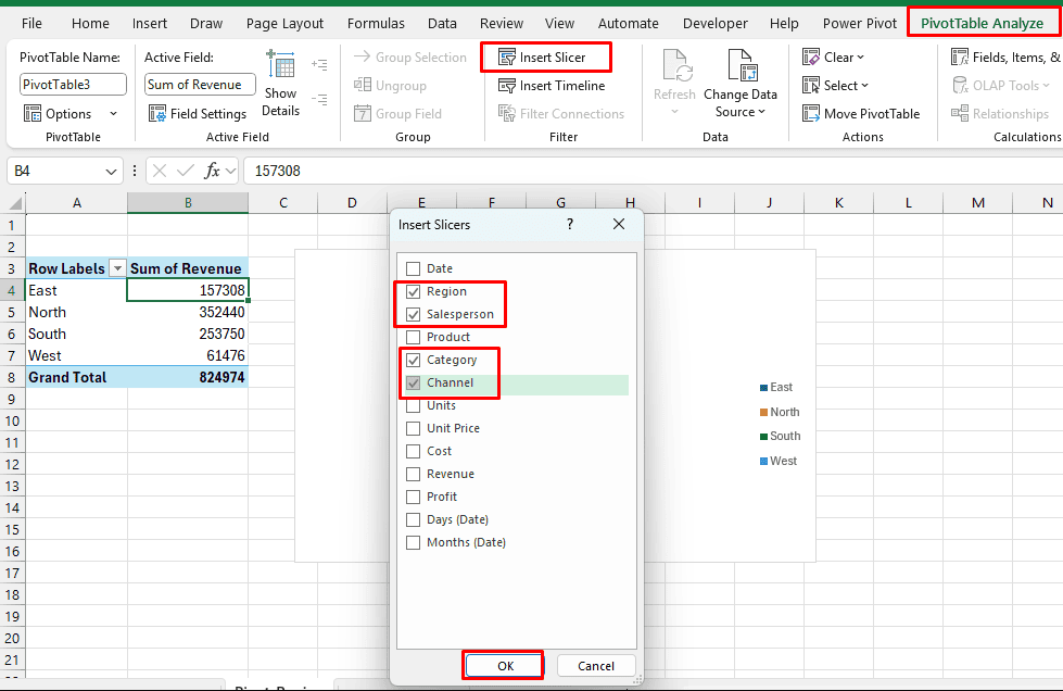
Add Slicers:
- Navigate to the PivotTable sheets, then select the PivotTable.
- Select Insert Slicer after selecting the PivotTable Analyze tab.
- Choose the fields you wish to filter by in the Insert Slicers dialog.
The following are common options for a sales dashboard:
- Section
- Purchaser
- Type of Channel
Press OK.

Attach Timelines and Slicers to Every PivotTable:
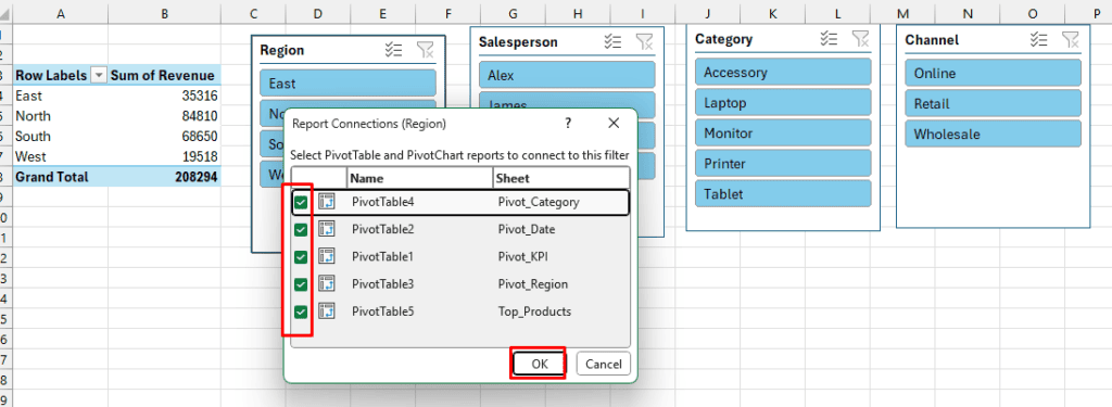
At the moment, each slicer is only linked to the PivotTable that it was inserted into. To make it dynamic and interactive, all PivotTables must be connected. All of the PivotTables (KPI, Date, Region, Category) will then be under your control.
Choose a Slicer, then right-click and choose Report Connections.

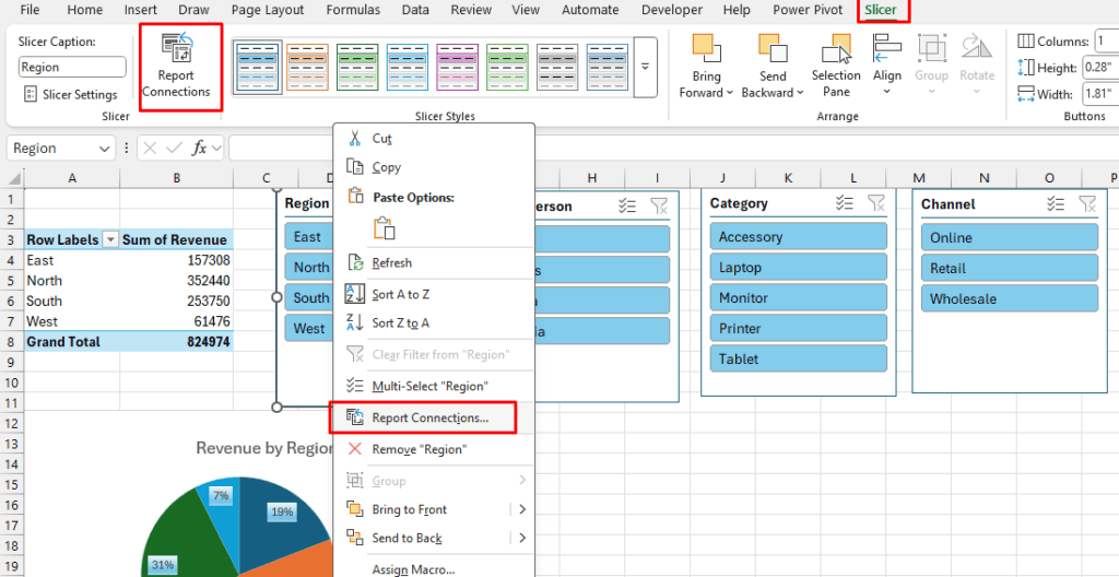
- Verify every PivotTable in the list that you want this slicer to manage.
- Click “OK.”

- For every slicer, repeat these steps.
- Transfer the Slicers to the Dashboard and place them next to or above your charts.
- Your KPIs and all charts will now automatically update to show only North region sales when you select “East” in the Region Slicer. All of the visuals change to reflect the sales of the salesperson you have selected.
Step 5: Include a Timeline (for Date Filtering)
You can add a Timeline to filter by date ranges using a slider if you’re using Excel 2013 or later.
- Click inside the PivotTable after navigating to the Pivot_Date sheet.
- Click the PivotTable Analyze tab, then choose Insert Timeline.
- Click OK after choosing the date.
- As with slicers, link the timeline to each PivotTable.

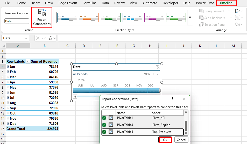
- Transfer the timeline (cut and paste) to the Dashboard sheet.
- Put it beneath your slicers.
- To filter by a particular range of days, you can now drag the timeline. Your charts and KPIs will update right away.
Step 6: Add KPI Cards to the Dashboard Sheet
You must now make a specific dashboard sheet and add your metrics to it.
- Open the Pivot_KPI sheet.
- Determine which cells contain the KPI metrics.
- Return to the Dashboard and enter the KPI levels in the upper rows.
- The data can be retrieved by using the GETPIVOTDATA function.
- Choose cells, then enter the following formulas.
Total Revenue:
=GETPIVOTDATA("Total Revenue",Pivot_KPI!$A$3)
Average Order Value:
=GETPIVOTDATA("Avg Order Value",Pivot_KPI!$A$3)
Total Units:
=GETPIVOTDATA("Total Units",Pivot_KPI!$A$3)Total Profit:
=GETPIVOTDATA("Total profit",Pivot_KPI!$A$3)Number of Orders:
=GETPIVOTDATA("Number of Order",Pivot_KPI!$A$3)
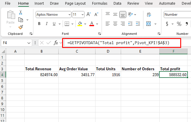
KPI Cell Format:
- Make the numbers larger and bold (e.g., font size 16–20).
- Use appropriate number formats, such as decimals, currency, and numbers.
- At the top of the dashboard, you can add shapes that resemble “cards” and apply cell borders and fill colors.
- These KPIs will alter when you use slicers to filter because they are based on a PivotTable.
Step 7: Complete the Dashboard’s Design and Layout
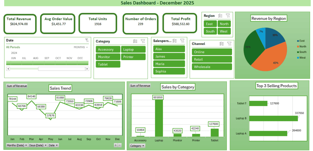
A dashboard should be easy to read, straightforward, and balanced. Add a new sheet with the name Dashboard. Keep in mind that less is more.
Charts and Place Cards:
- KPI cards (Total Sales, Units Sold, Average Value) at the top.
- Interactive charts (Trend Chart, Category Share, Region Performance) in the middle.
- Slicers positioned at the top or on either side.
Additionally, you can use themes, colors, and shapes sparingly so that the data is the main focus.
Format Numbers Clearly:
- Money for earnings.
- Whole numbers for orders and units.
Dashboard Format:
- Choose the complete sheet.
- Navigate to the Home tab, choose Cell Styles, and then pick a contemporary theme.
- Select the View tab and uncheck Gridlines.
- If necessary, freeze the top row.
Dynamic Title:
="Sales Dashboard - " & TEXT(TODAY(),"mmmm yyyy")
Step 8: Analyze Interactivity
Test the dashboard’s interactivity now.
- Choose a few months from the Date timeline and a category from the slicer.
- View all KPI metrics and charts.

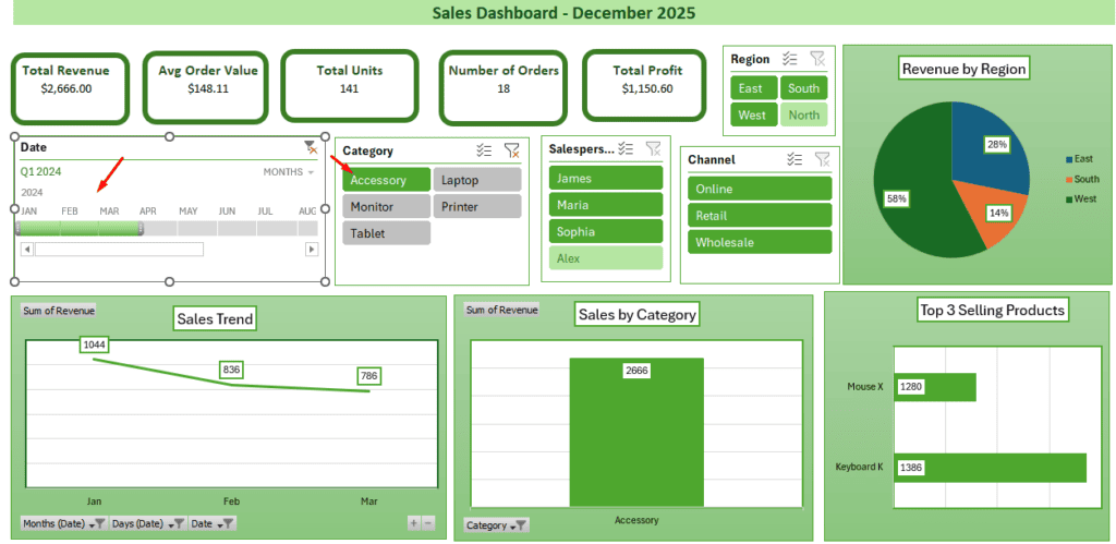
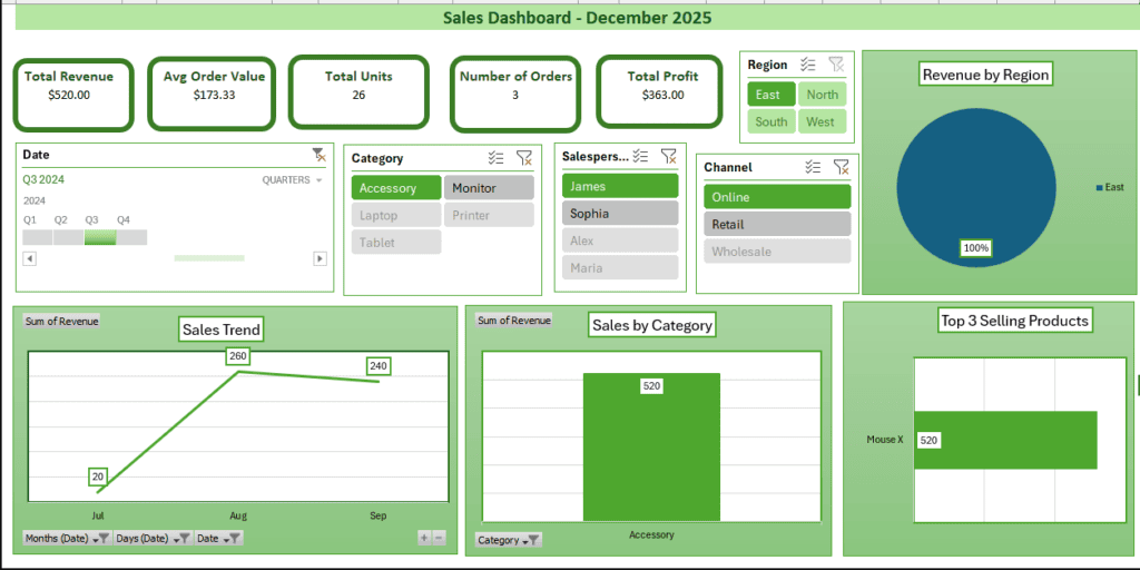
Excel filters the PivotTables internally when you drag the timeline or click on a slicer button. The dashboard as a whole updates in real time since those PivotTables power the charts and KPI card cells.
- Choose a quarter from the timeline.
- Choose from each slicer and review every update.
- To view the update, you can also add or remove rows or data from the SalesData table.

Step 9: Include More Advanced Features
KPIs with Conditional Formatting
Within the Top 3 PivotTable:
- Include TotalSales in a new column.
- Navigate to the Home tab, then choose Conditional Formatting, Icon Sets, and finally arrows or circles.
Make a Time Intelligence Calendar Table
You can make another date table if your data contains sales information from several years. A separate date table is ideal for dashboards.
- Create a new sheet and give it the name “Calendar.”
- Add two columns: MonthYear and Date.
- Enter the first date of your data (for example, 1/1/2024) in A2.
- To cover your whole date range, drag down or use Fill Series.
In B2 for MonthYear:
=TEXT(A2,"mmmm yyyy")In C1 for Year:
=YEAR(A2)In D1 for Month:
=TEXT(A2,"mmmm")In E1 for the Month Number:
=MONTH(A2)Press Ctrl + T to turn this range into a table, then give it the name Calendar.
Add Connections (Excel Data Model)
You will need to use Power Pivot to establish a relationship between other data tables whenever you have distinct data sheets for Products, Customers, etc.
- Turn on Power Pivot (in Excel 2013+ with Power Pivot enabled or Excel 2016+).
- Click on the Power Pivot tab and choose Add to Data Model.
Build Connections:
- Drag Calendar[Date] → SalesData[OrderDate].
Final Thought
You can create an interactive sales dashboard by following all of the detailed instructions. Creating an interactive Excel sales dashboard is a useful ability that aids in turning unprocessed data into insights that can be put to use. From preparing a dataset and making PivotTables to designing KPI cards, adding slicers, and setting up a tidy dashboard layout, we have demonstrated each step. To create a fully interactive, polished sales dashboard that allows users to filter by region, representative, category, and date range using slicers/timeline, follow the instructions and practice all the features.